Tint V&T
Designing beyond visuals: Voice and Tone and Notifications systems
Voice and tone are how we communicate with our customers. The brand principles are our voice. However, as in a real conversation, the tone we use changes the perception of the message.
Brand voice principles for tint
Perceptive, creative, seasoned, clear, confident, ambitious, fair

Flexing the tone for the message type – To make it easy to figure out when to use which principles, I applied them to examples of tone based on the type of message we were trying to convey to the user.
Message loudness
This is not something we tend to think about, but it helps to clearly tie in voice and tone to the notifications system: how loud do we need to be?
Is it urgent? Is it a destructive action? We should interrupt the user experience with a modal.
Is it medium? An in-context reminder will do, like a toast or a banner. This is more likely confirmation of an action, or educational content.
Is it low? In field validation will do. Wrong password, missing information and invalid tokens.
It’s also important to tie in some best practices to help guide people in their day to day. From reminding them to use actionable buttons and CTAs (using the copy to talk about the UI itself with a click here is so 2001, after all), to what do we as brand think of emoji usage and how we use contractions. Every little detail will ensure the customer knows when we are talking to them, and will add the consistency and cohesiveness of our brand.
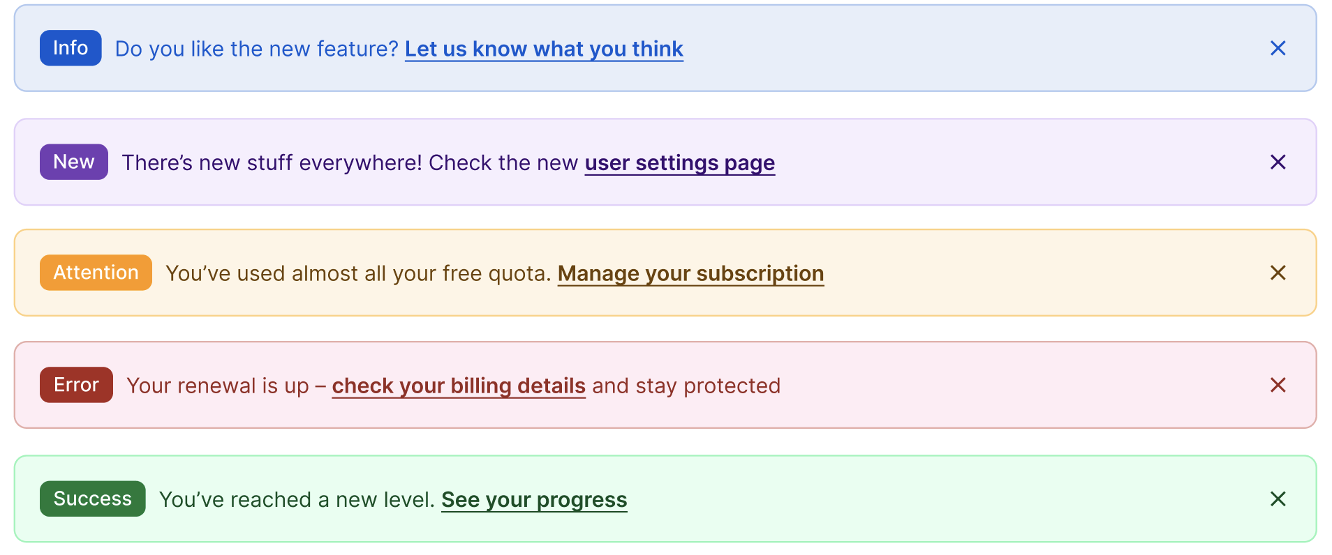
Banners are colour coded based on the purpose of their use, and stack when multiple are triggered. The idea is to maintain the same colour associations throughout the app.Of course we would never have this many showing at one time!
Notifications system
"A notification system is so much part of a digital product’s UX that without it, the product would feel as if something was left out. If there is no “visibility of system status” and feedback, it is akin to driving a car without a dashboard."
I had the initiative some time to look at our notification system (different notification types and purposes). I took into account:
The type of information being communicated
The urgency of the information—whether it needs to be seen immediately
Whether user action is required as a result of the information
Using these as principles and making sure we were optimising for fast scanning and expectation management, I led a workshop with the Design and Engineering team in which we galvanised this initiative and linked it to our Design System and our Voice and Tone guide. Collaborative approaches mean a shared sense of ownership, and bigger chances of a change actually sticking.


Next steps
It became clear through this exploration that in the future we’d need a notification centre since it's easy to dismiss something and afterwards realise you needed the information. Since this started collaboratively, we have the advantage of a united front between design and engineering on how we would tackle this, and what would be its purpose.

Don’t take my word for it though – here’s some feedback from one of the Engineers I worked closely with!