Design system
A quick glance at how the design system changes improved the look and feel of the app
An end-to-end Design System
A design system is a set of reusable components and guidelines that help teams unite around a common language during the creation and life of a product.
Having a Design System to source from can speed up development, reduce cognitive dissonance when it comes to how to tackle a problem and most importantly: manage users expectations at every turn. In an ideal world your product becomes familiar, you get less customer support calls and people get what they want done quicker.
When I arrived, we were halfway through a marketing-led rebrand at Tint, but our product still felt scrappy and dated. I had the opportunity to lead this change in the product side, using accessibility principles and best-in-class examples as guidelines.
The rebrand for Tint
This work of translating the new logo and brand into a new product was super fast: 1 month from joining, we were shipping our first incremental change and officially launching the rebrand. It was an intense collaboration with both the marketing team and the UI pod with full-stack engineers dedicated to the project. We used Storybook to document component usage, to bridge the gap between Figma and development further.
Highlights:
The new typescale at Tint takes in consideration the screen resolutions it will be most used in.
A lot of care went into making sure the colour palette would be accessible – one colour with the others, and also the lightest VS darkest version of the same colour. That way, we could ensure contrast in coloured text, like in labels and banners.
A focus point updating the navigation, and making sure it would scale to the expected growth of the platform without it becoming a place to dump all new features.
To make sure the product felt sleek and modern, a good dose of whitespace was inserted into it, limiting the max-width of the container based on most used screen resolutions. We also inserted glassmorphism to overlays and dropdowns, to give it an extra edge.
Why did we take on this project?
To help facilitate our growth, to create an end-to-end visual language for the product and marketing teams, and to elevate our look and feel to match our brand personality. Strong brands with a clear purpose, position, and reputation outperform weak brands by 20%. And people want to hear focused messages that speak directly to their needs.
What was Impacted?
Everything from colours, fonts and max-width to the way we think about notifications and our Voice and Tone. We took a holistic look at our design and updated everything - including the logo.
What is the point:
It is efficient – enables people to work using the same basis, increasing their speed
It is consistent – the product will have a consistent branding, look and feel throughout
Manages expectations – users will know where to go to get something done
It scales – as we grow, so will our product and our design needs. We are ready.


principles used: REUSE, REDUCE, REVAMP
Reuse
Reusable components - both for design and for engineering. We bridged that gap between disciplines using common language, and kept it scalable and easy to use through thorough shared documentation (we used Storybook). This documentation is extensive, including: use cases, of what is appropriate when and where, dos and don’ts and best practises.
REDUCE
Reducing choice to the essentials and using naming conventions that are human readable restricts possibilities for both designers and engineers . Developing new pages and features becomes less error prone. From 10 shades of a colour to 6, named from lightest to darkest. From 3 blues to 1.
A good example of this was banners types: we had both a warning and an attention banner. The definition of both was pretty close, and no-one could tell when to use each one. The solution? Pick one. Also, note that we went for a naming convention hat stems from the purpose of the component, such as success, attention, failure, rather than relying on colours like green, yellow and red. The design token is the tiniest element of the design system. Design tokens are named entities that store visual design attributes in an agnostic, human-readable abstraction of visual styles that sync with all the style files in the system.
Revamp
We took on the concept of end-to-end to the max: we can’t communicate without words, and a clear Voice and Tone guide ensures we communicate consistently with our customers.
This approach, linked to the creation of a Voice and Tone and Notifications system, keeps us consistent to our overall brand. It means we’re comprehensive in our understanding of user experience, from words to visuals.
Experimenting with dark mode as part of the Tint UI and UX revamp
Our Voice and Tone guide
Voice and tone are how we communicate with our customers. The brand principles are our voice. However, as in a real conversation, the tone we use changes the perception of the message.
Brand voice principles for tint
Perceptive, creative, seasoned, clear, confident, ambitious, fair

Flexing the tone for the message type – To make it easy to figure out when to use which principles, I applied them to examples of tone based on the type of message we were trying to convey to the user.
Message loudness
This is not something we tend to think about, but it helps to clearly tie in voice and tone to the notifications system: how loud do we need to be?
Is it urgent? Is it a destructive action? We should interrupt the user experience with a modal.
Is it medium? An in-context reminder will do, like a toast or a banner. This is more likely confirmation of an action, or educational content.
Is it low? In field validation will do. Wrong password, missing information and invalid tokens.
It’s also important to tie in some best practices to help guide people in their day to day. From reminding them to use actionable buttons and CTAs (using the copy to talk about the UI itself with a click here is so 2001, after all), to what do we as brand think of emoji usage and how we use contractions. Every little detail will ensure the customer knows when we are talking to them, and will add the consistency and cohesiveness of our brand.
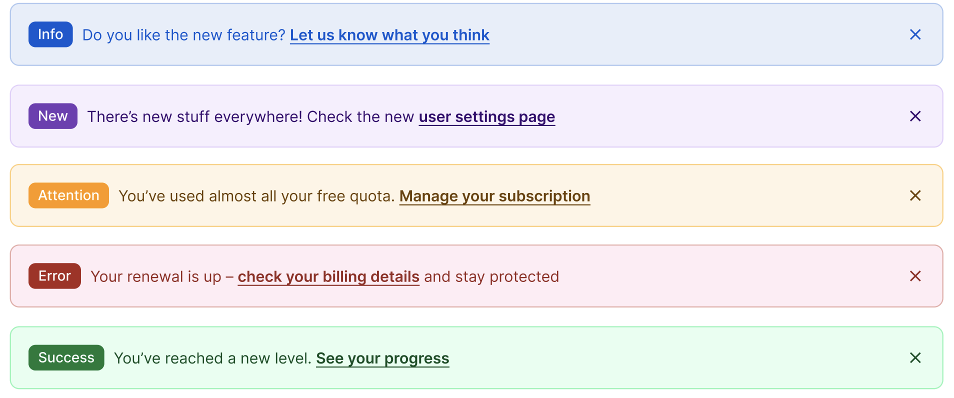
Banners are colour coded based on the purpose of their use, and stack when multiple are triggered. The idea is to maintain the same colour associations throughout the app.Of course we would never have this many showing at one time!
Notifications system
"A notification system is so much part of a digital product’s UX that without it, the product would feel as if something was left out. If there is no “visibility of system status” and feedback, it is akin to driving a car without a dashboard."
I had the initiative some time to look at our notification system (different notification types and purposes). I took into account:
The type of information being communicated
The urgency of the information—whether it needs to be seen immediately
Whether user action is required as a result of the information
Using these as principles and making sure we were optimising for fast scanning and expectation management, I led a workshop with the Design and Engineering team in which we galvanised this initiative and linked it to our Design System and our Voice and Tone guide. Collaborative approaches mean a shared sense of ownership, and bigger chances of a change actually sticking.


Next steps
It became clear through this exploration that in the future we’d need a notification centre since it's easy to dismiss something and afterwards realise you needed the information. Since this started collaboratively, we now have an united front between design and engineering on how we would tackle this, and what would be it’s purpose.

Don’t take my word for it though – here’s some feedback from one of the Engineers I worked closely with!